Building a custom checkbox with Knockout

OK, you say. What does Knockout have to do with this? After all, there are plenty of ways to create a custom checkbox without Knockout. To which I say: You're right, grasshopper, but it's so much more elegant with Knockout. A lot of the pure CSS solutions rely on the ":checked" selector which isn't supported in older versions of IE (surprise!) and Firefox, so you have to write some intialization javascript and a little piece of javascript to keep the CSS class up to date.
We'll build a checkbox that:
- Doesn't need custom javascript
- Doesn't need the ":checked" selector
- Is 508 compliant
- Is using a standard checkbox-input under the skin
Here's the markup for the checkbox, where "Estimate" is a boolean property in the Knockout viewModel:
<label class="estimate" data-bind="css: Estimate() ? 'on' : '' ">
    <input id="Estimate" data-bind="checked: Estimate" type="checkbox" /> Estimate
</label>
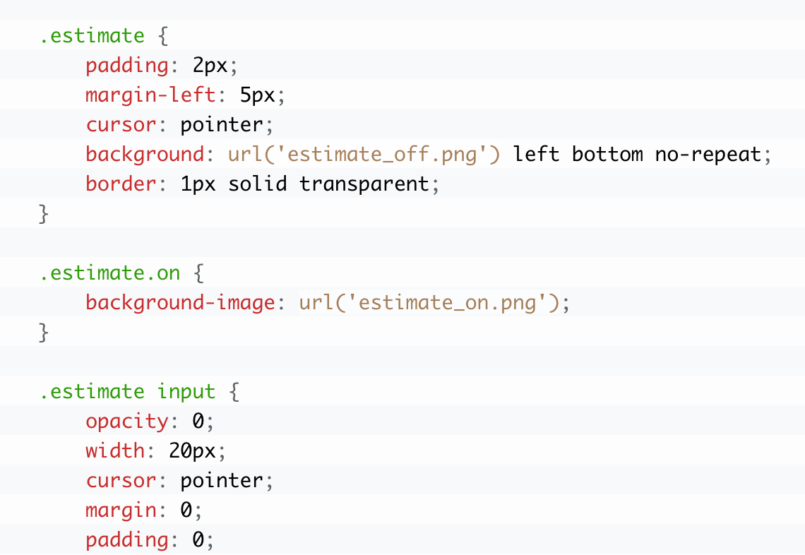
And here's all the CSS we need:
.estimate {
    padding: 2px;
    margin-left: 5px;
    cursor: pointer;
	background: url('estimate_off.png') left bottom no-repeat;
	border: 1px solid transparent;
}

.estimate.on {
	background-image: url('estimate_on.png');
}

.estimate input {
	opacity: 0;
	width: 20px;
	cursor: pointer;
	margin: 0;
	padding: 0;
}
```
This is the result:

The knockout binding is pretty straightforward: We bind the input to the knockout property like we normally would and then bind the css class of the label based on that property as well.
The CSS is pretty simple as well. We simply hide the actual input by setting its opacity to zero. Then we swap out the background image of the label element based on the class that the knockout binding is responsible for.
So there you have it. You can use any background image you want to make the checkboxes look however you like.
